 you’ve probably heard it before but a reminder dosen’t hurt.
especially on a monday.
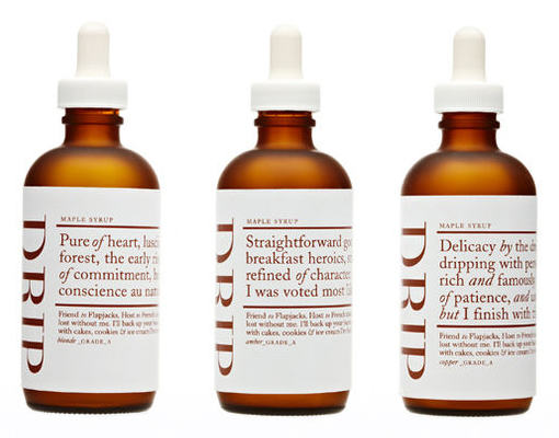
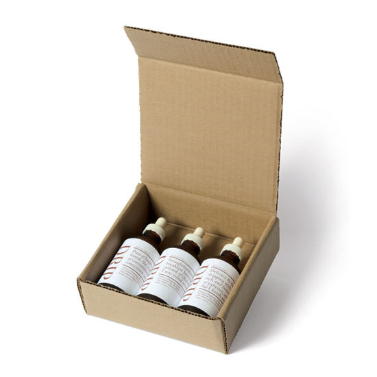
this is a new trend (if it can even be called that?) in packaging design i’m quite fascinated by: breaking the agreement between how the design should be in relation to the product. for example: maple syrup in medicine-like packages. how would you react as a customer?
is it perhaps the ultimate way of making a product stand out in the shelf?
or the safest way to scare of buyers?
images via the dieline


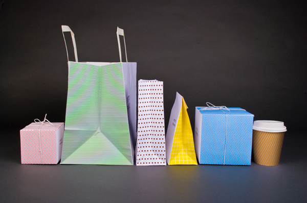
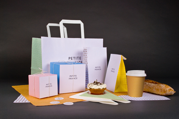
i looove this! the name, the patterns, the packages.. so inspiring! simple, personal, quirky, playful and very loveable. and seriously – is there any better way to market a product than to make people love it? sex sells but love blinds making people come back for more, tell their friends about it, help the company develope the product, believing blindly in it and being loyal to the company. just look at apple..
found via my favorite packaging blog – the dieline.

lot’s of text at once but just this one too..
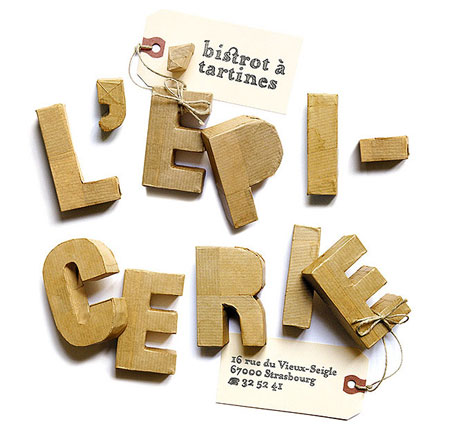

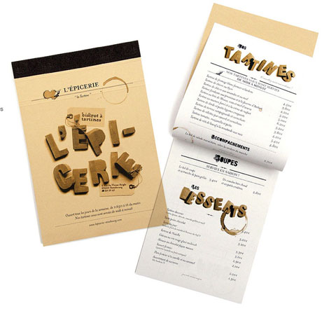
french design firm my beautiful have created the loveliest font i have seen in quite some time, hand made letters photographed on a white bakground, making them appear 3d. i think both the idea and the result is amazing.. found via oh joy!


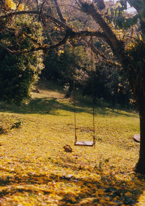

i found this set of pictures in one of my folders and they were so neatly placed next to each other that one might think that they actually do belong together.. unfortunately i only know two of the sources, the first picture is from introphonics lovely flickr and the third one is from parachutgirl. i love the grass lettering in the last picture!
update: the notice-sign is by david shrigley. thank you very much eira for informing me!
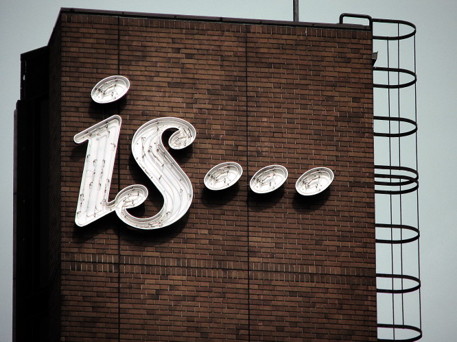
this is perhaps my favorite typography sign ever. check out more here. i would write something more if i wasen’t so late.. but being in time is hard.

